tldr
We created an interactive, storytelling website to help people understand how data, algorithms, automated decision systems are used in New York City government.
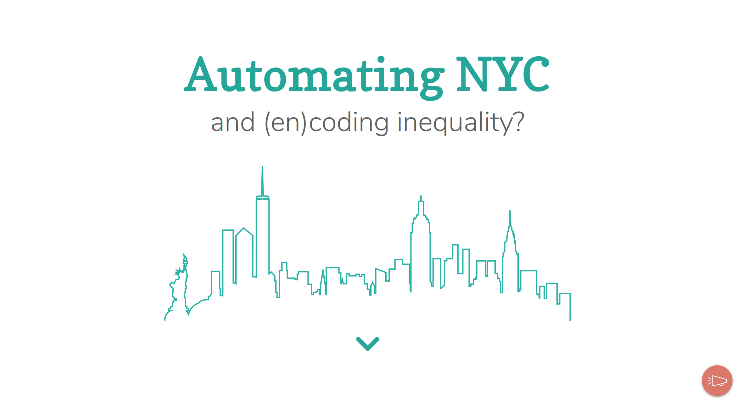
Screencap of the landing page.
client
This project is my applied thesis for the Harvard Kennedy School. It was supported by the Jain Family Institute.
problem
How can we help people understand big data and algorithms in public services?
solution
We created Automating.NYC to open the black box around data, algorithms, and predictive analytics in city government and encourage people to advocate for automated decision systems that are designed with equity in mind.
interact
Explore Automating.NYC here.
process
Background Research From September through December 2018 we conducted extensive background research focused on literature reviews and interviews with ethics and machine learning experts. In January 2019 through March 2019 we shifted to interviews with city agencies and companies which make the proprietary algorithms for our case studies.
Ideation We used design methodologies like the KJ method and card sorting to storyboard and develop the initial flow of the website.
Design We developed the initial site colors based on photos from an in-person visit to New York City. We then tested the colors, fonts, and other site elements with users until we reached a design aesthetic centered on being friendly and informative.
Prototyping We user tested multiple prototypes, started with low fidelity paper prototypes and moving on to higher fidelity wireframes. We user tested continuously as we developed the website, with over 30 user tests informing the final product.
After finishing, we sent a beta version of the website to experts and city agencies to confirm the accuracy of the information and get final feedback before publishing.
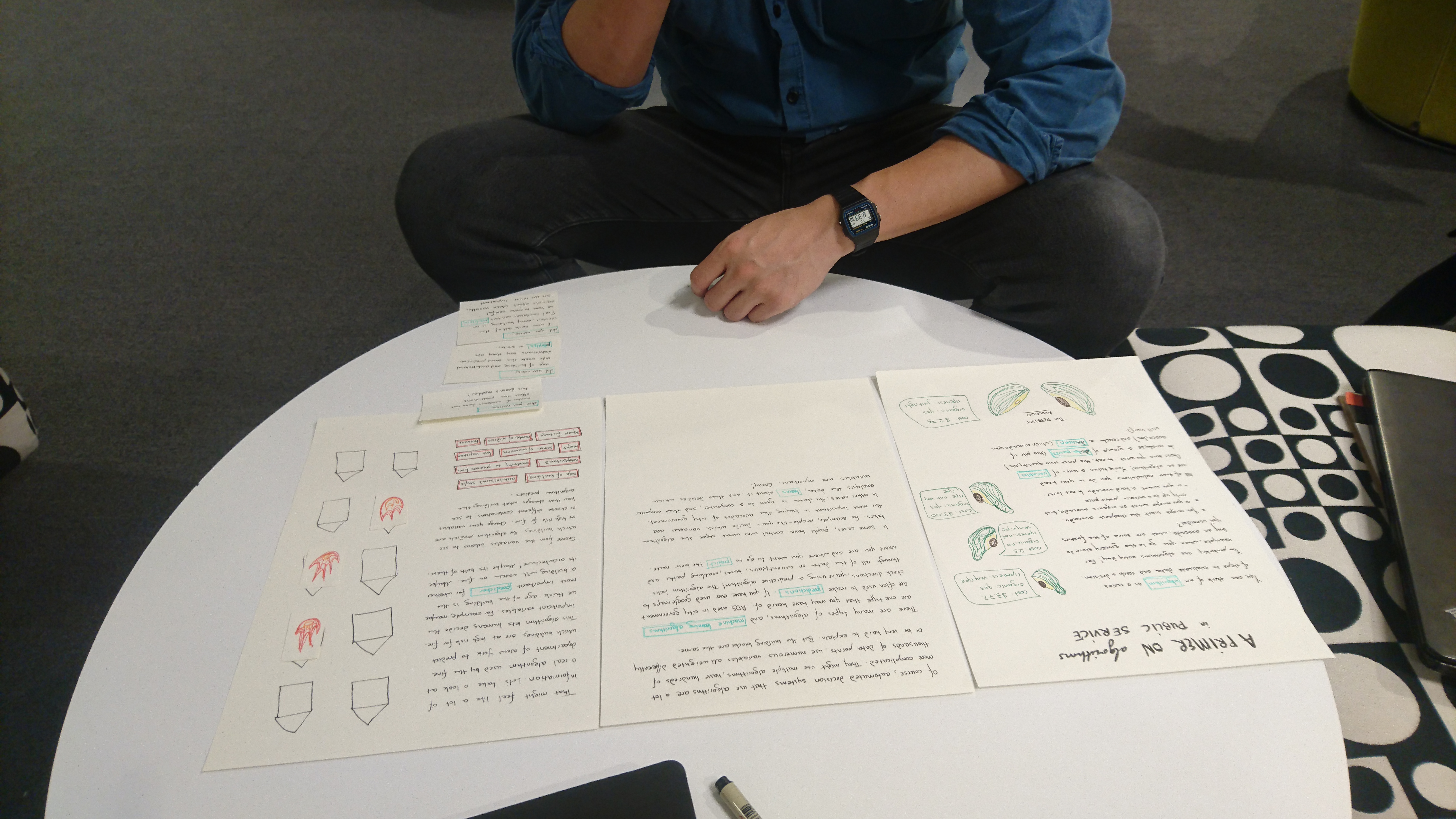
Usability testing a paper prototype of the toy algorithm.
timeline
October 2018 - May 2019
tools
JavaScript
JQuery
D3.js
HTML + CSS
R
Inkscape
Adobe Illustrator
team
Jon Truong
Elyse Voegeli
Aki Younge
Deepra Yusuf
press
What’s an algorithm? Let an avocado explain. Fast Company
Featured in A Toolkit for Centering Racial Equity Throughout Data Integration from Actionable Intelligence for Social Policy (AISP) at the University of Pennsylvania
Featured in Critical Data Literacy Tools: A Guidebook from the Data Justice Lab at the University of Cardiff