tldr
We redesigned the physical touchpoints and artefacts for Boston's Code Enforcement division to make them more user friendly. The redesign was informed by a discovery sprint and user research throughout.
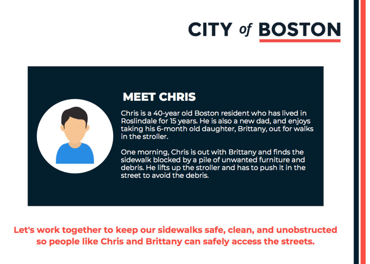
Prototype of one informational insert included with the redesigned ticket.
client
Boston Code Enforcement is a division of the Department of Public Works which monitors the city and gives out tickets for code violations (for example, improper shoveling of snow).
problem
How might we spark behavior change in Boston residents resulting in fewer tickets given and more tickets paid?
insights
Our user research revealed three key insights. One, city residents did not understand their code enfocement responsibilities and the exact requirements to avoid code violations. Two, residents were mistrustful of the envelopes. Many people didn't realise this was an official envelope from the City of Boston and threw them away. Three, people found the tickets difficult to understand.
The key elements of our redesign were therefore authority, simplicity, and plain language.
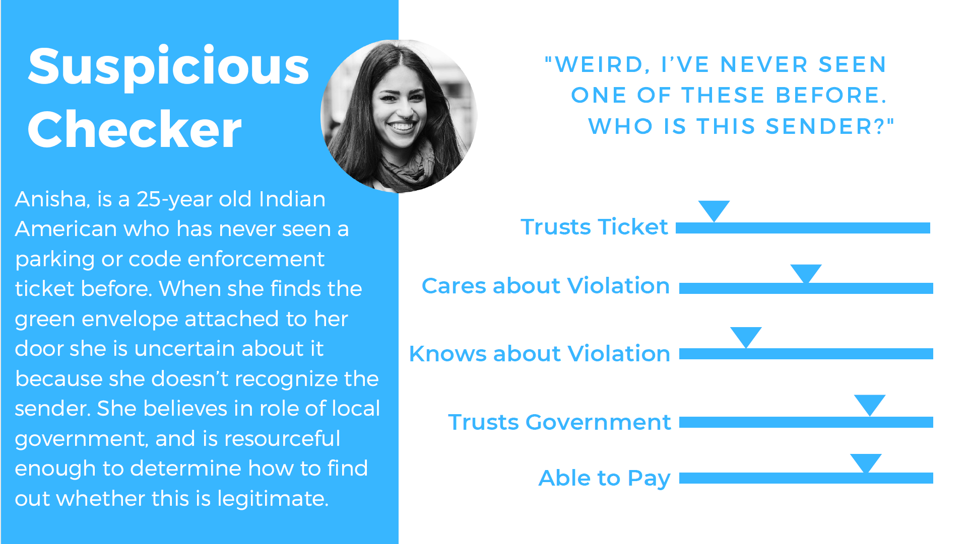
One of the five user profiles we developed.
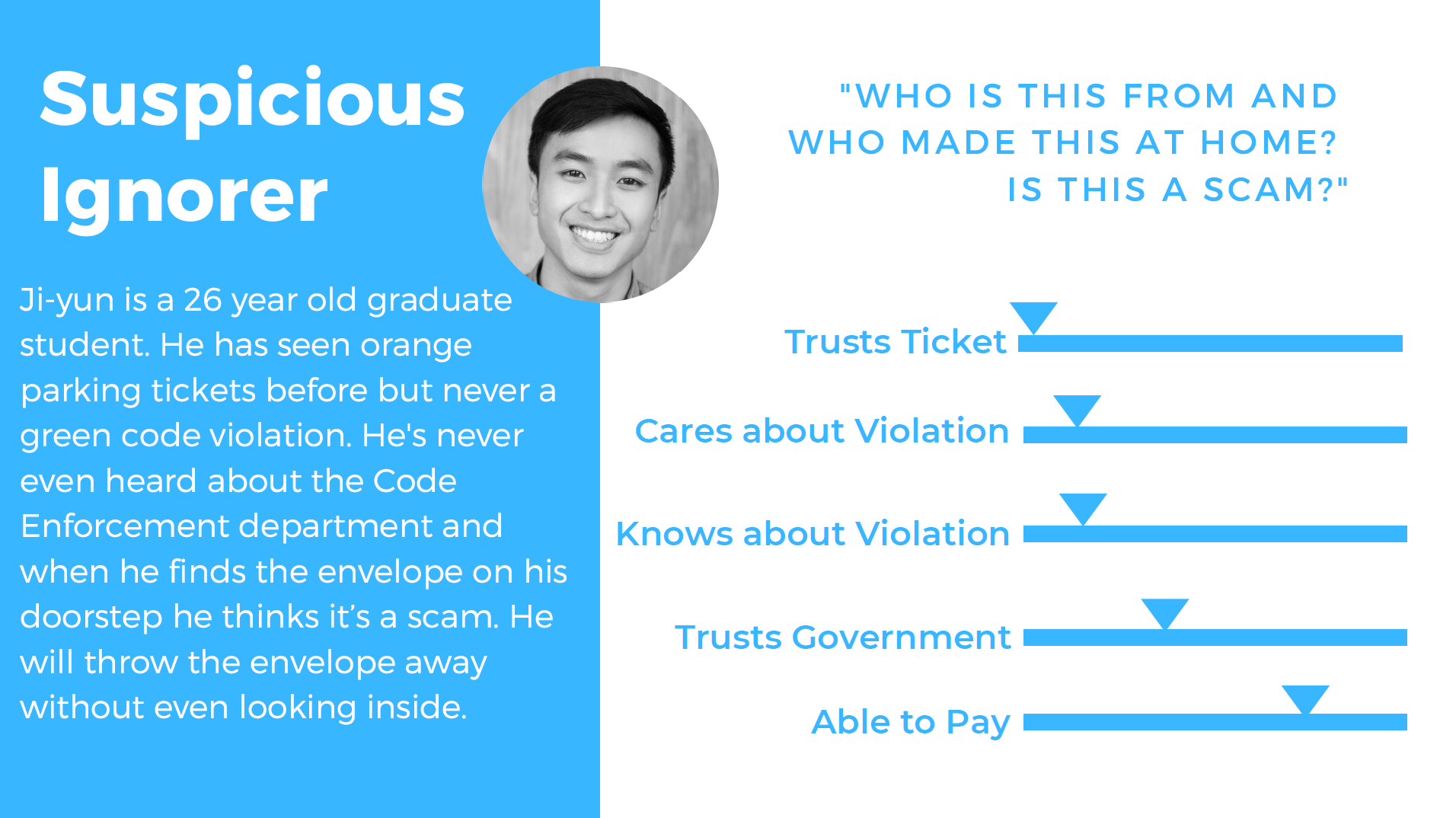
Another of our user profiles.
solution
We focused on the physical touchpoints the city has with Boston residents when they receive a ticket. We redesigned the envelope and ticket using behavioral insights and design principles, created an educational insert, redesigned the past-due letter and created a follow up letter, and redesigned the website flow to focus on a unified landing page.
View all of our redesigns and learn more here.
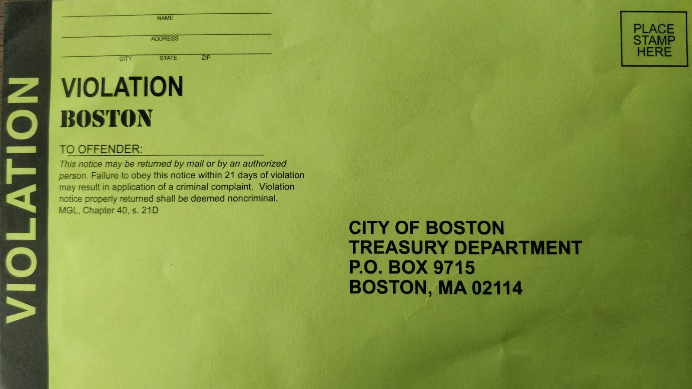
The original envelope.
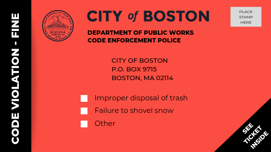
The redesigned envelope.
process
User Research From January through March 2019 we did background research through data analysis, best practices in other cities, ride alongs with officers, and interviews/observations with users (Boston residents) interacting with Code Enforcement.
Prototyping In March through May, we brainstormed solutions and prototyped our 5 touchpoints. We created lo-fi versions of each idea and tested them in the real world, updating and improving each time. Some of the designs went through as many as 8 iterations and 58 user interviews.
In May we settled on our final versions and handed them off to the city where they'll be rolled out to over 600,000 Boston residents.
Learn more about our process here.
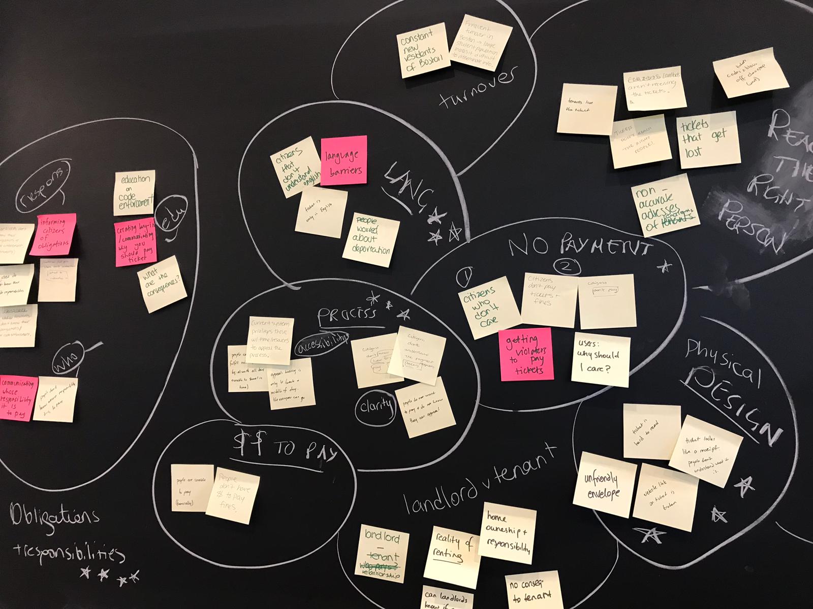
Was it even a design session if there were no sticky notes?
impact
The City of Boston's digital team launched a pilot of our recommendations in August 2019. After finding an increase in ticket payments with the new envelopes, they made further iterations and launched the changes city-wide.
timeline
January 2019 - May 2019
tools
Inkscape
Adobe Illustrator
Tableau
team
Clare Herceg
Naeha Rashid
Ariana Soto
Elyse Voegeli
Clarisa Yerovi