tldr
We created a readable, visual, plain-language microsite to accompany Data for Black Lives and Demos new report, Data Capitalism.
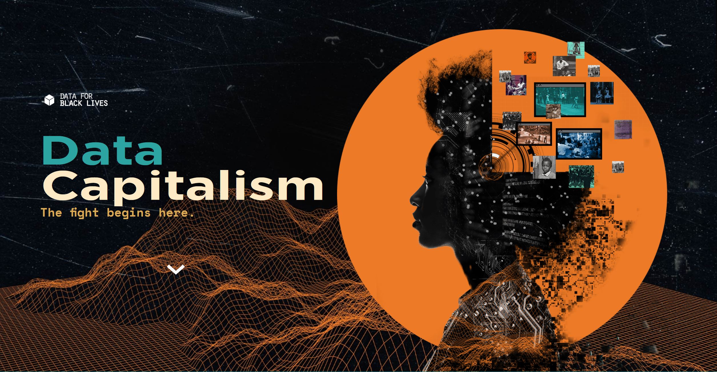
Screencap of the landing page.
client
Data for Black Lives is a movement of activists, organizers, and mathematicians committed to the mission of using data science to create concrete and measurable change in the lives of Black people.
problem
How might we ground data capitalism in the reality of people’s lives and give them hope to intervene?
solution
The microsite we created is much more than a digital version of the Data Capitalism report. Rather, it presents the key learnings from the report through narrative. The intention of the microsite is to reach a different user base than those who might read an academic report. As such, we focused our work on simplicity, readability, and accessibility and made the microsite short and visually engaging. The site scores a 9th grade reading level on Flesch-Kincaid readability tests.
interact
Explore the Data Capitalism microsite here.
process
We began the project with a design thinking workshop with Data for Black Lives to identify the problem statement. This workshop informed the design direction for the website to be grounded in real stories, rather than simply a re-written version of the report.
Demos created the style guide for the print report and we built off this for the website visual style. Though we used a few of the illustrations created by Demos for the site, the majority were created for the microsite exclusively.
We initially wireframed the site and information architecture using sketches and then developed higher fidelity prototypes in Figma with feedback from user testing sessions. Our prototypes went through several iterations before we built out the site in Webflow. After a final round of testing and changes in Webflow, we made our final changes directly to the codebase of the site.
The final site was informed by 13 user testing sessions, grouped in three batches over a month. It was very important to us not only that our designs be co-created with users through feedback sessions, but that our research be non-extractive and so we compensated user testers for their time.
Our final QA process before code hand-off to the client involved testing across many devices and browsers, and doing a full accessibility audit of the site with a screen reader.
timeline
March - May 2021
tools
Figma
Webflow
Adobe Photoshop
Adobe After Effects
Adobe Illustrator
team
Jon Truong
Elyse Voegeli
Aki Younge
Deepra Yusuf
David Perrin